Top Menu Options
Option 1: Logo on the Left
Green Version: Logo on the Left
Purple Version: Logo in the Middle
Gray Version: Logo in the Middle
Topper Options
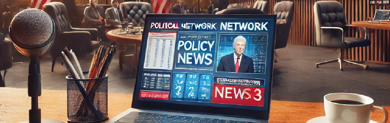
Image Slider
A dynamic image slider showcasing key messages and images.

Accounting Excellence
Streamline your financial operations with precision.

Legal Precision
Efficiently manage your legal operations.
Government Efficiency
Enhance operational transparency and security.
Main Content Layout Options
Full-Width Layout
A bold, full-width layout with no sidebars.
| Main Content |
Sidebar Layout
A versatile layout featuring a sidebar for extra navigation or information.
| Sidebar | Main Content |
Grid Layout
A balanced grid layout ideal for showcasing multiple content blocks.
| Block 1 | Block 2 |
| Block 3 | Block 4 |
Split Layout
A modern split layout with dual columns for juxtaposing text and visuals.
| Column 1 | Column 2 |
Image Style Options
Rounded Corners
Images with smooth, rounded corners for a softer look.

Image Shadows
Subtle shadows add depth and separation for a dynamic effect.
Bordered Images
Images framed with a border for a defined, classic look.
Heading Options
H1 Style
Bold and impactful main headings for your pages.
This is an H1 Heading
H2 Style
Strong, clear subheadings to introduce sections.
This is an H2 Heading
H3 Style
Subtle yet refined headings for content sections.
This is an H3 Heading
Button Styles
Primary Button
A strong, bold button with a solid background.
Secondary Button
A subtle button with a light background.
Outline Button
A clean button with a border and transparent background.
Form Elements
Text Input
A dark-themed text input with rounded-md corners.
Textarea
A dark-themed textarea for multi-line input.
Select Dropdown
A dark-themed select dropdown with rounded-md corners.
Checkbox & Radio Buttons
Dark-themed checkboxes and radio buttons with rounded accents.